Colors speak louder than words. The colors you choose for your brand do more than just make it look good; they convey emotions and feelings that can make your brand relatable to your audience.
Key Takeaways:
- Choosing the right color palette is crucial for your website as it can impact your brand identity, target audience, emotions, and accessibility.
- Consider factors such as brand identity, target audience, industry, and psychology when creating a color palette for your website.
- To create an effective color palette, start with a base color, choose complementary colors, consider a color tool, and implement color theory for harmony.
What Is a Color Palette?
A color palette is a collection of colors that are carefully selected to be used in a design, such as a website, to create a cohesive and visually appealing look and feel.
When creating a color palette for a website, you need to consider various factors, including the target audience, brand identity, and the emotions you want to evoke.
Each color in the palette serves a specific purpose – from primary colors that grab attention to neutrals that provide balance. Color psychology plays a crucial role in choosing the right hues to elicit specific responses from visitors.
Why Is Choosing the Right Color Palette Important for Your Website?
“Choosing the right color for a brand is like picking the right note for a song; it can either harmonize to create a beautiful melody or clash to create dissonance.” – Marc-Aurele
Selecting the appropriate color palette for your website helps directly impact the perception of your brand, influences user behavior, and conveys specific emotions and messages – color psychology plays a significant role in website design.
For example, warm colors like red and orange can evoke a sense of urgency or excitement, while cool tones like blue and green signify stability and harmony.
By strategically incorporating these hues, you can guide visitors toward specific actions or emotions. Consistency in color choices across various elements fosters brand recognition and enhances user trust.

Factors to Consider When Choosing a Color Palette
When selecting a color palette for your website, it is essential to consider factors such as color theory, branding guidelines, primary, secondary, and tertiary colors, complementary color schemes, saturation levels, warm and cool color choices, and the importance of contrast.
Primary colors, namely red, blue, and yellow, are the foundation of all other colors. They cannot be created by mixing other colors.
Secondary colors, like purple, orange, and green, result from mixing primary colors. Tertiary colors are a blend of primary and secondary colors. Complementary colors, such as red and green, create a vibrant contrast when used together.
Saturation levels determine the intensity of a color, with high saturation being more vivid. Warm colors like red and orange evoke energy, while cool colors like blue and green offer a calming effect.
Brand Identity
Consistency in the color scheme across all brand touchpoints, from the logo to website design, fosters a cohesive brand image. This coherence helps in brand recognition, making a brand memorable and distinguishable in a saturated market.
With a well-thought-out color palette, a brand can effectively communicate its personality and values to its audience, further solidifying its brand identity.
Target Audience
Understanding the demographics, preferences, and psychographics of your target audience is crucial when choosing a color palette for your website to ensure that the colors resonate with and appeal to your specific audience.
Analyzing the characteristics of your audience helps in determining which colors invoke positive emotions and perceptions among them.
For instance, younger audiences might be drawn to bright and trendy colors, while older demographics may prefer more subtle and traditional hues.
Adapting your color choices to align with the expectations and values of your target market can significantly impact the overall user experience and engagement on your website.
Industry and Niche
The industry and niche of your business play a significant role in determining the appropriate color palette, as different industries have established color conventions and associations that can influence consumer perceptions.
For example, in the healthcare industry, blue is often used to instill a sense of trust and professionalism, while green is associated with health and tranquility.
Conversely, in the food and beverage industry, vibrant and appetizing colors like red and yellow are frequently employed to stimulate appetite and convey energy.
In the technology sector, sleek and modern color palettes featuring shades of blue, black, and white are commonly utilized to communicate innovation and reliability.
On the other hand, the fashion industry embraces bold and trend-setting color combinations to evoke emotions and create strong brand identities.
Emotions and Psychology
Color psychology is a critical aspect to consider when choosing a color palette for your website, as different colors evoke specific emotions, moods, and perceptions that can influence user behavior and engagement.
The color red, for example, is often associated with energy, passion, and urgency, making it a popular choice for calls-to-action buttons on websites, driving users to take immediate action.
On the other hand, blue is known for its calming and trustworthy qualities, frequently used by corporate brands to convey a sense of reliability and professionalism.
Color contrast is also essential in design, as it helps create a visual hierarchy and improve readability by making important elements stand out.
Accessibility and Contrast
Ensuring accessibility and contrast in your color palette is crucial for creating a user-friendly website that is inclusive to all users, including those with visual impairments, by carefully selecting background colors, typeface colors, and maintaining proper contrast levels.
When designing a website, it is essential to consider the readability and usability for all users. Accessibility plays a key role in ensuring that visitors can navigate your site comfortably, regardless of any visual limitations they may have.
By opting for background colors that complement the text color and offer enough contrast, you can enhance legibility. Choosing typeface colors that stand out against the background not only makes the content easier to read but also improves overall user experience.
One way to maintain sufficient contrast is to adhere to WCAG guidelines for color contrast ratios. These guidelines provide specific recommendations to help you select colors that are accessible to a wide range of users.
Testing your color choices using online tools can also assist in ensuring your color palette meets accessibility standards.
Remember that an accessible color scheme doesn’t have to compromise on aesthetics; harmonizing colors creatively can result in an attractive and user-friendly design.
How to Create a Color Palette for Your Website
To create a color palette for your website, start with a base color that reflects the mood or brand identity you aim to project. Then, work around this color to create a color palette that conveys your brand identity.
Start with a Base Color
Choosing a base color is the foundation of your color palette and sets the tone for your website design, based on color theory principles and the emotional impact you want to convey to your audience.
Color theory serves as a guiding principle in this process, helping designers understand how different hues can elicit specific emotions and responses in viewers.
Choose Complementary Colors
Selecting complementary colors (also known as analogous colors) that harmonize with the base color is essential to create visual interest and balance in your color palette, often done by referring to a color wheel to identify complementary hues.
An effective way to select complementary colors is to look at the color wheel and choose the color directly opposite your base color. For instance, if your base color is blue, its complementary color would be orange. This pairing creates a vibrant and eye-catching combination that can be used in various design elements.
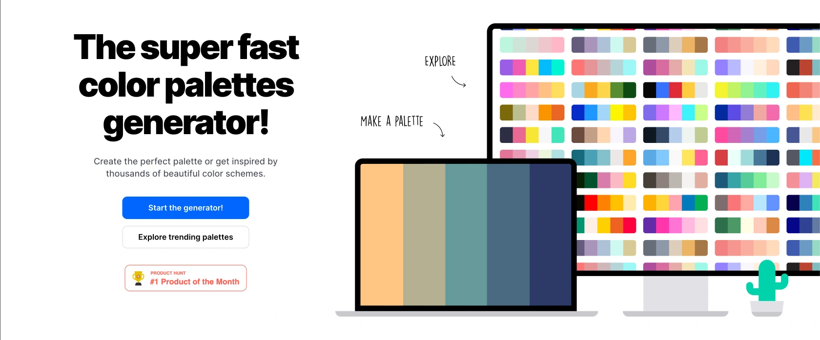
Consider Using a Color Tool
Utilizing a color tool can help you select color schemes, understand color harmonies, and identify complementary colors, analogous colors, and triadic color relationships to create a visually engaging and balanced color palette.
Practical tip: Start by deciding on a base color, then explore adjacent colors by going to coloors.co > Tools > Color picker > place you base color in there. Coloors.co will privdie zou with a list of analogous, complementary colors, and palettes ready for you to use in you designs.
Examples of Effective Color Palettes for Websites
Effective color palettes for websites can range from bright and bold schemes that grab attention to minimalist and neutral palettes that convey elegance and sophistication, showcasing a wide array of design possibilities to suit different branding and design needs.
When creating a website for a high-end fashion brand, a monochromatic color palette of soft pastels and whites can evoke a sense of luxury and refinement.
Conversely, a tech startup aiming for a modern and cutting-edge image might opt for a complementary color scheme of blues and oranges to convey innovation and creativity.
In contrast, a nature-based organization could benefit from an analogous palette of greens and browns to establish a connection with the earth and sustainability.
Bright and Bold Palette

Bright and bold color palettes are attention-grabbing and energetic, often used to create a vibrant and lively visual impact that appeals to audiences seeking a dynamic and lively online experience.
This color choice is particularly effective in capturing users’ attention, guiding them through the website’s content, and creating a memorable brand image.
Bright colors evoke emotions like joy, enthusiasm, and creativity, which can positively influence user perception and encourage interaction.
When strategically incorporated, bold color combinations help establish a strong visual hierarchy, making key information stand out and navigation intuitive.
Minimalist and Neutral Palette

Minimalist and neutral color palettes exude simplicity, elegance, and sophistication, often preferred by brands aiming for a clean and timeless aesthetic that communicates professionalism and simplicity.
These color schemes typically consist of soft hues like beige, ivory, gray, and white, creating a calming and harmonious visual experience for the user. By utilizing minimalist and neutral colors, websites can achieve a sense of spaciousness and clarity, allowing the focus to remain on the content rather than overwhelming the viewer with excessive visuals.
Neutral colors also evoke a sense of sophistication and luxury, offering a versatile backdrop that complements various design elements and accent colors. When used effectively, these palettes can convey a sense of modernity and elegance, making them ideal for brands looking to establish a refined and upscale image.
Pastel and Soft Palette

Pastel and soft color palettes evoke a sense of calmness, serenity, and softness, often chosen for websites targeting audiences looking for a soothing and gentle visual experience that conveys a sense of peace and tranquility.
These color schemes are widely used in web design due to their ability to create an atmosphere of relaxation and comfort. The gentle hues of pastels promote a quiet and inviting ambiance, making users feel more at ease when navigating through a site. By opting for soft colors like pastels, websites can establish a visually appealing and harmonious environment, ideal for promoting stress-free browsing and enhancing user engagement.
Monochromatic Palette

A monochromatic color palette consists of variations of a single hue, offering a harmonious and sophisticated design approach that relies on tonal variations to create depth and visual interest subtly and elegantly.
By utilizing different shades and tints of one color, you can establish a sense of cohesiveness and unity throughout their projects. This simplicity in color choice allows for a seamless integration of elements and enhances overall readability, making it an effective choice for both digital and print mediums.
Tips for Implementing Your Color Palette on Your Website
When implementing your color palette on your website, ensure consistency across all pages, test for accessibility, consider color contrast for readability, and use colors strategically to highlight important elements and create a visual hierarchy.
Consistency is key to creating a cohesive user experience.
- Choose a primary color that reflects your brand identity and complement it with a secondary palette for variety.
- Utilize color psychology to evoke desired emotions from your users.
- Ensure that the colors you choose align with your brand message.
- For accessible design, evaluate color combinations using.
- Maintain adequate color contrast ratios to facilitate readability for all users, including those with visual impairments.
- Utilize white spaces effectively to balance your color scheme and prevent visual overload.
Build your own branded website using these principles ⇒
Frequently Asked Questions
What is a color palette and why is it important for my website?
A color palette is a set of colors that are chosen to represent a website. It includes a primary color, secondary colors, and accent colors. Having a well thought out color palette is important for your website because it creates a cohesive and visually pleasing design that can attract and engage visitors.
How can I determine the perfect color palette for my website?
There are a few ways to determine the perfect color palette for your website. One method is to consider your brand’s logo and use the colors from there. Another method is to research color psychology and choose colors that evoke the emotions you want to convey on your website. You can also use online color palette generators to help you find complementary colors.
What are some common mistakes to avoid when creating a color palette for my website?
A common mistake to avoid is choosing too many colors. Stick to a maximum of 3-4 colors to keep your design clean and cohesive. Another mistake is using colors that are too bright or clash with each other. It’s also important to consider color accessibility for those with color blindness or vision impairments.
Can I change my website’s color palette in the future?
Yes, you can always update your website’s color palette in the future. However, it’s important to maintain consistency with your brand identity and consider the impact on your website’s overall design. It’s best to consult with a designer or do thorough research before making significant changes to your color palette.
How can I incorporate my brand’s personality into my color palette?
Your brand’s personality can be reflected in your color palette through the use of specific colors. For example, if your brand is fun and playful, you may want to use bright and bold colors. If your brand is more professional and serious, you may opt for muted and neutral tones. It’s important to choose colors that align with your brand’s overall image and messaging.
Are there any tools or resources I can use to help me find the perfect color palette for my website?
Yes, there are many tools and resources available to help you find the perfect color palette for your website. Some popular options include Adobe Color, Coolors, and Color Hunt. These websites offer color palettes, color generators, and inspiration from other websites and designs. You can also consult with a professional designer for personalized guidance and recommendations.