Creating a navbar includes making sure all the important call-to-actions (CTAs) and page URLs are present at all times throughout the website within a sticky header while ensuring responsiveness across all devices. Also utilizing a bit of CSS code to make it look fancy. Keep reading…
What You'll Learn
Creating a fancy responsive website navbar with Elementor Pro is easy as long as you have a clear vision and understand basic Flexbox properties.
Why is a Responsive Navbar Important?
Responsive website navigation is vital for improving the overall user experience by providing intuitive pathways for visitors to efficiently explore a website’s content. A well-structured navigation system not only guides users smoothly through web pages but also ensures accessibility on all devices, including mobile.
What Makes a Website Navigation Responsive?
A responsive website navigation means it works well on all devices. Here’s how using a page builder like Elementor can help make a website navigation responsive:
Simple and Minimalistic Design: Keeping the navigation simple helps users find what they need without confusion. With fewer items, your website looks cleaner and operates faster.
Using Flexbox Containers with Percentages: Elementor lets you use Flexbox containers, which adjust the size of your navigation items based on the screen size. By using percentages for widths, everything scales up or down smoothly as the screen size changes.
Using Icons for Mobile: On smaller screens like phones, using icons instead of text can save space and make the navigation look neat. Icons are easier to recognize and click on smaller devices.
Popup Main Menu on Mobile: Instead of squeezing all the menu items into a small space, you can delegate your main menu items to a popup for mobile devices. This makes the navigation cleaner and enhances the user experience, as users can easily open and close the menu as needed.
What are the Different Types of Website Navigation?
Website navigation can take various forms to accommodate diverse user preferences and design aesthetics. Common types include:
Top Navigation
The most common navbar accross the web
Top navigation is the most widely used website navigation pattern that places menu items at the top of the page, offering users easy access to primary site sections.
Side Navigation
An alternative navbar that can be used on specific pages
Side navigation is an alternative website navigation layout that positions menu items along the side of the page, offering a vertical menu structure for users to explore different content sections.
Hamburger Menu
Is mostly used for mobile navigation
The hamburger menu is a popular website navigation icon that typically conceals menu options behind an icon, providing a clutter-free interface for users on mobile devices.
Footer Navigation
Is always present on all pages
Footer navigation is a supplementary website navigation feature located at the bottom of web pages, offering users access to secondary links, contact information, and site policies.
Creating the Top Navigation
This is assuming you have created all (or most) of your pages in WordPress.
Now, it is important to establish that: The WordPress menu and our Header are two different things
The Header is the container (or wrapper) that will hold all of our navigation items like the WordPress menu and other important call-to-actions (CTAs).
What is most important now is planning. What are we going to include in our WordPress menu and more importantly, what are we NOT going to be including…
For example, we may want to include important CTAs like Partner-Up, Contact Me, Subscribe, or Shop Now as buttons instead of plain text (as seen in the image above).
Much of this depends on the type of website you are building but, in most cases, this is how it should be:
What is the most important page for you? This is your important CTA (Shop Now/Subscribe/Contact Me/Hire Me etc.)
Then, your essential pages. These could be your Blog section, About me page, unique selling point (USP), Home page, Portfolio, etc. These are the essential pages that must be included in your navigation menu (WordPress menu).
Then, you have the “other” pages. Legals, blog, News, FAQ, Support, Policies, etc.
Create menus in WordPress
Now that you know what you will include in your WordPress menu (navigation item), and what you will not, let’s create your first menu.
Step 1. After you have created your pages, head over to “Appearance” -> “Menus” and name your first menu to “Main Header Menu”. In the Menu Setting, you can tick the “Header” box as this menu itself will be going in our header. Now, “Create Menu”.
Creating the Main Header Menu
Step 2. Adding your pages to the menu. On the left hand side, all the pages you have created will appear. If you can’t see the pages you’re looking for, select the “View All” tab (this will show you all your pages). Start by ticking the pages you want to add and then click “Add to Menu”. Then, “Save Menu.”
Start by adding the pages you want to appear within your plain text navigation menu. We will add my Home page, Why Me, Who am I, and Contact Me.
Note: I will not be adding my most important CTA as I will add that later on as a button.
Adding pages to the menu
Designing the Desktop Header Navbar with Elementor Pro
Now that we have our main navigation menus, we can include them within our header and footer designs.
Step 1 Head over to your Elementor “Theme Builder” located in the WordPress dashboard menu and go to “Templates” -> “Theme Builder”.
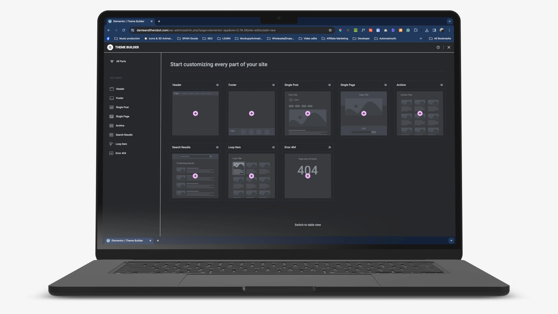
You should now be within the Elementor Theme Builder.
The Elementor Theme builder is where you create all essential pages like all the single pages (product page, blog post page, blog archives 404 page, and any other page that would compile the overall theme of your website). Here, you are essentially designing your own custom theme.
Elementor Theme Builder
Now, click on the plus icon where you see the “Header”.
This will take you to where you need to be to edit your website header. This is what your page should look like:
We will not be needing any of the templates provided as we are going to create a custom header. Close it.
Important: Before we proceed please make sure that you have activated the feature “FlexBox Containers” within your Elementor settings. It SHOULD be activated by default.
Activate Flexbox container
Active? Cool, now we can continue to design our header navbar navigation. You should be on a blank page something like the image below. Or, if you have already started with your Home page, you will see your Home page content.
Setting the Parent (Wrapper) Container
First, let’s name our header. To do this, go to the settings icon (bottom left) -> “Title” -> give it a name (e.g. Header).
Now add your first Container widget -> select “FlexBox” -> “Select any structure” . This will serve as the main wrapper for holding everything inside.
Let’s make sure that this main wrapper remains at “Boxed” for content width, and set the “Width” to the value of your choosing. I will set it to 1200px as that is how my main website structure is laid out.
In the Layout” tab, set a “Min Height” of 80px.
In the “Style” tab, set the background color to transparent.
In the “Advanced” tab and apply a negative margin of 80px and a z-indey of something high like 999 (this will matter later).
(OPTIONAL) Set your header to sticky if you want it to stay high up on the viewport whenever you scroll down. Do this in the “Advanced” tab -> Motion Effects -> set “Sticky” to “Top”.
While in the “Motion Effects”, you can add a nice “Entrance Animation” to your header too. I usually select the “Fade in down”.
Adding The Child (inner) Containers
Now add another container within this container.
Do this by clicking on the little plus icon in the center of the conatiner itself and then clicking on the “Container” widget.
This will automatically add a new child container inside.
This time, make sure that the “Container Width” is set to “Full Width” and 100% – we want this container to occupy the full width of the parent (wrapper) container.
Ensure the direction is set to “Row Horizontal” -> “Align Items” center -> “Gap” 0 and 0
(OPTIONAL) In the “Style” tab: Go to Border -> set the “Border Radius” to 30px – this will make your Header Navbar have rounded sides.
(IMPORTANT) Advanced tab: Set all padding to 0 -> In the “CSS Classes” add the value “card-blur” – this is what will make it look fancy later on when we add the custom CSS code.
Now, we just need to add our Logo, menu, and CTAs within our Header navbar. For this, we need to add a container for each, in this case, three containers (logo, menu, CTAs).
Now that we are beginning containers within containers, using the Elementor Pro navigation menu on the right-hand side comes in handy.
Select the inner container (also known as the child container).
In case you are lost and cannot find the Conainer widget, you need to click on the widget’s icon on the left-hand side at the very top. On the right side of the “Elementor” logo.
Then, once you have selected the correct container using the navigator, click on the container widget to add an additional container inside.
Let’s configure a few essential settings for this one container before we duplicate it.
Set the Content Width” to full width
Duplicate this container twice by slecting it -> right click -> duplicate (or CMD/CTR D)
We should have three containers set side-by-side like this:
Adding The Menu, Logo, and CTA Buttons
Now that you have three containers, you can decide where you would like to place your logo, menu, and CTA button.
Let’s say, we went for the logo in the middle and the navigation menu and CTAs on the sides.
With that in mind, first, we adjust the Justification and Alignment of our three inner containers.
Set Container #1 to 40% width, “Direction” to row – horizontal and the “Gaps” to 0 on both. Also, set the padding to 0 in the “Advanced” tab.
Set container #2 to 20% width, Justify and Align in the center and the “Gaps” to 0 on both. Set the padding to 0 in the “Advanced” tab.
Set container #3 to 40% width, “Direction” to row – revresed and the “Gaps” to 0 on both. Set the padding to 0 in the “Advanced” tab.
Note: the percentages add up to 100% meaning that we are occupying the full width of the parent container.
Now, let’s add our logo to the container in the middle.
Select the middle container, go to the widgets, and click on your “Site Logo”.
Make sure to adjust the “Style” of the logo and set a value for the width to 70px.
Make sure not to go over 80px as that would surpass the height we initially set for the parent container itself above. If you do, make sure to go back and adjust the height of the parent container.
Now, the navigation menu.
Go to the widgets -> WordPress menu -> Place it into the left container. Now, select one of the menus we created earlier (Main Header Menu of course).
For the container on the right, we’ll be adding a button – this will be the CTA. The most important button of them all.
Important: This button depends on the type of website you are building. It could be a button to the shop page, a button to the prices page, a button to the Contact Me, or any other page you deem important.
Select the container on the right -> go to the widgets -> click the “Button” widget.
Style the button however you wish in the “Style” tab. Making sure the colors align with your brnad.
You should have something that looks like this (with a difference in colors):
Navigation and CTA on the sides, and logo in the center.
Style the Menu and CTA Button
Before we move one, you might want to style the menu and CTA button.
Styling the menu is easy. There are only a few things to modify. Click on the menu widget (either directly or through the Elementor navigator tab).
Modify the following for a minimalistic navigation menu look:
“Alignment” set to “left”
“Pointer” set to “none”
Go to the “Style” tab
“Typography” set to either “small text” or leave it as default
In its “Normal” state, set it to your default text color
“Hover” state, set to your primary brand color
As the “Active” state, set to your brand color.
“Horizontal padding” should be set between 6px and 12px
“Vertical padding” should be about 5px
“Space between”, you can set to 0px
The rest, we don’t need as we will be creating a completely different menu for tablets and mobile devices.
For the CTA button:
Make sure you name it whatever you deem appropriate in the “Text” area
Set the “Link” top the page you want to send your visitor by clicking on the link area, start typing in a page title and select the page.
In the Style tab, set the colors for the text and background for both the “Normal” and “Hover” states.
Add some border-radius (if you want rounded corners) or set to 0 (if you want a square button).
You might want to adjust the “Padding” in order for the button to fit nicely on all devices. I recommend you set the padding to 8px (top and bottom) and 12px (right and left).
Make it Fancy with CSS
This is the easy part. In order to make it fancy, I like to use a CSS blur effect. Here is the code for a simple blur effect.
Copy and paste this code into your custom code panel in Elementor Pro. This will add the popular blur effect behind your Header navbar.
Important: When pasting the code, make sure to add <style> (before) and </style> (after). See image.
Go to the WordPress dashboard -> Elementor -> Custom Code -> Add New -> Give it a name -> Set the location to be </body> – End -> Paste it in -> Publish -> Set the conditions to be “Entire Site” -> Save and Close.
To make sure the website navbar is responsive for all devices, there are three things we need to do here.
First, set your viewport to “Tablet”.
Any settings or styling that you apply on the tablet view, will automatically apply on mobile.
Then, select the container that holds the menu (container #1) and add a new “Lottie Animation” widget inside.
You should now have the menu hamburger (from before) and the new Lottie animation widget within the same container. Like this:
The final thing before we add our Lottie animation is, hiding the menu hamburger menu from both the tablet and mobile view.
So, using the navigator on the right, select the WordPress Menu, head over to the “Advanced” tab, scroll down to where it says “Responsive”, and select both “Hide On Tablet Portrait” and “Hide On Mobile Portrait”.
Now, let’s find a cool Lottie icon that will serve as our tablet and mobile menu icon. My favorite place to scout for Lottie animations is Lordicon.com.
So, head over to their website and select a menu icon that suits your use case.
Looking through their “User Interface” category, I found this cool globe animation that I will use.
Change the colors to your brand color, press the “Lottie” option, and download as “Minify”.
www.lordicon.com
Now, you are ready to add this Lottie animation to the Lottie widget in your website navbar.
Head back to your navbar, select the Lottie widget, and upload the recently downloaded Lottie animation to your widget. Liek so:
Now, set the correct settings and style your Lottie widget icon to properly fit the navbar.
Head over to the “Content” -> “Settings tab, and set the “Trigger” to “On Click” – this will make sense later.
Now in the “Style” tab, adjust the width to 100% -> set the “Max Width” to 70px.
Finally, in our “Advanced” tab: go to “Responsive -> “Hide On Desktop”.
We do not want this Lottie animation to appear on our desktop because we already have our WordPress navigation menu for that.
You should now have something like this:
Do not worry about the previous hamburger menu, it will not show on the live site.
We are pretty much done for now with the navbar so we can now hit “Publish” (or “Update”) on the bottom left ->make sure the display settings are set to “Include”: “Entire Sire” -> “Save & Close”.
Creating the Tablet and Mobile Menu Navigation
Now, for the important part. As mentioned earlier, the website navigation for tablet and mobile will appear as a popup.
So, let’s create our tablet and mobile menu popup.
First, you need to head back to the WordPress dashboard by pressing CMD/CTR – E -> type in “Dashboard” -> click on Dashboard.
Now create your first popup.
For creating Popups with Elementor Pro, you need to head over to “Templates” -> “Popups” -> and “Add New Popup”.
Call it Mobile Menu and hit “Create Template”.
Once again, close the initial tab for using the pre-made templates and you should be ready to customize your popup.
First, make sure that you are working on the Tablet view since this popup will only show up for tablet and mobile devices.
Remember: Any changes or modifications you do on tablet view, will automatically cascade (also apply) down to mobile.
Now, let’s start by configuring some essential settings for the popup itself.
Head over to the global popup settings at the bottom left (next to the “Publish” button).
Here we have the global Popup settings.
First, in the “Settings” tab the popup width to “VW” and set the value to 90.
“Height” should be “Fit to Screen” and “Content Position” to Center.
This makes sure it occupies at least 90% of the viewport width and is 100% the height of the screen.
Then, set the “Horizontal” to “left”, the vertical as is.
Entrance and Exit Animation is up to you, but, I set them to Fade in Left and Fade in Right. Make sure the duration is less than 1 second so that it appears quickly.
For the “Style” tab.
Change the color to whatever you want (white in my case).
Advanced tab:
All you have to change is the “Disable Page Scrolling” -> set to “Yes”.
Now you are ready to add some content to the popup menu.
Click on the plus icon and add a container widget (Flexbox -> Direction – column). This will be our main wrapper (that holds everything together).
Now you should have a container in the middle of the popup.
Let’s configure some important settings for this wrapper container.
In the “Layout” tab, set the “Content Width” to 100%, “Direction” to column – vertical, “Justify” cneter, and “Align Items” to start. “Gaps” to 0 and 0.
“Style” tab, you can leave as is.
“Advanced” tab, add a large amount of padding to all sides like 60px.
Add A WordPress Menu to the Popup
Now that we have our main wrapper container, we can add a WordPress menu and set it as our main navigation menu for this popup.
Just like before, add the WordPress menu widget to the main wrapper container. Select the menu (Main header Menu in this case).
As of now, you will see our WordPress menu set as a hamburger menu. This is because we are currently in the tablet view.
Note: By default, the WordPress menu has a breakpoint value for Tablet Portrait (< 1024px). This means that if the viewport width falls under this particular value, the WordPress menu will automatically set itself as a hamburger menu.
Let’s change this by configuring our “Content” settings…
Head to “Breakpoint” -> set this to “none”.
Set the “Layout” -> Vertical.
“Alignment” -> Start
“Pointer” -> none.
Now, the “Style”…
“Typography” -> set the font “Family” to your brand font -> “Size” to 4em -> “Weight” to SemiBold (optional) -> “Line Height” to 1,5em (or what see fit).
Set the “Normal” color to your font color -> “Hover” to your brand color -> “Active” also to your brand color.
“Horizontal Padding” set to 0 -> “Verticla Padding” to 15px -> “Space Between” to 0.
You should have something like this:
Now, the super important CTA button.
Let’s add this button just under our WordPress menu.
Select the wrapper container using the Elemntor Navigator on the right.
Go to the widgets section and add a button by simply clicking on it.
Style the button using your brand colors.
You should now have the main CTA button just under your WordPress menu.
Now to make some minor changes for mobile devices. Head over to the mobile viewport…
To make sure this menu popup is responsive for both tablet and mobile, we need to adjust the font size for mobile.
Once in the mobile view, head back to the WordPress menu -> “Style” tab.
“Typography” -> Change the font size to something more appropriate like 2.3em.
If it fits, and everything looks good, you should be done with the popup menu.
Note: You don’t have to stop there. You can add more navigational items and widgets to this popup menu and customize it to your liking.
To finish with this popup menu, we need to “Publish” -> Conditions set to Include: Entire Site -> Triggers no changes -> “Advanced Rules” set to Show on Devices “Yes” and make sure to remove “Desktop” -> “Save & Close”.
Now, we just need to connect it to the navbar we created earlier.
Connecting our Popup Menu and the Website Navbar
Now, it is just a matter of activating the popup menu we just made to the Lottie animation we have within the header navbar.
So, let’s head back to the WordPress dashboard by pressing CMD/CTR E -> type in “Dashboard”.
Go back to the Elementor Pro Theme Builder.
“Templates” -> “Theme Builder”.
Select the header from earlier and click “Edit”.
We will be connecting the popup menu to our Lottie animation. This is what will activate the menu popup on click.
So, select the Lottie widget -> set the “Link” value to “Custom URL”
Select the dynamic tag button -> go to the “Action” category -> select “Popup”
Click on the rench icon -> search for the “Mobile Menu” -> select it.
Now, whenever the Lottie icon is clicked, it will trigger the Mobile Menu popup.
Test and Refine Your Navigation
Testing and refining website navigation is a continuous process that involves gathering user feedback, analyzing navigation performance, and iteratively optimizing the navigation system based on user interactions.
Collecting user feedback through surveys, heatmaps, and session recordings provides valuable insights into user preferences, behavior patterns, and areas needing navigation refinement.
For example, the blur effect and menu popup seem to be working fine.
However, I see some issues with the Lottie icon. It is a little too large for my liking.
So, let’s go back to the “Theme Builder” -> “Header” -> “Edit”
Make sure to click on the Lottie widget in the Elementor Navigator and reduce the size to something smaller like 60px.
Do this for both the Tablet and Mobile views.
Keep testing and analyzing your website navbar and make any required changes before going live.
Frequently Asked Questions
How do I create a user-friendly website navigation?
There are several key elements to creating a user-friendly website navigation. These include keeping the navigation simple and organized, using clear and concise labels, and including search and filtering options for easy navigation.
Why is it important to have a user-friendly website navigation?
A user-friendly website navigation is crucial for providing a positive user experience. It allows visitors to easily find what they are looking for, reduces frustration and confusion, and ultimately leads to higher conversion rates and customer satisfaction.
What are some common mistakes to avoid when building a user-friendly website navigation?
Some common mistakes to avoid include having too many navigation options, using unclear or vague labels, and not optimizing for mobile users. It’s also important to regularly test and update your navigation to ensure it remains user-friendly.
How can I improve my current website navigation?
You can improve your website navigation by conducting user testing, using analytics to see how visitors are navigating your site, and implementing feedback from your audience. Additionally, regularly reviewing and updating your navigation can help improve its usability.
What are some best practices for building a user-friendly website navigation?
Some best practices include keeping the navigation consistent across all pages, using a logical hierarchy with main categories and subcategories, and including a clear and prominent call-to-action button. It’s also important to consider the needs and preferences of your target audience.
How can I ensure my website navigation is accessible for all users?
To ensure accessibility, use alt tags for images, provide keyboard navigation options, and avoid using small or low-contrast fonts. It’s also important to follow web accessibility guidelines and regularly test your navigation with assistive technologies.
Views:36
Get Fresh Content
Join a mailing list of over 1,000 people that receive new content monthly.
What You'll Learn
Related Content
Read more related content or visit our knowledge base.
Key Highlights Start your online store today with easy steps Choose a domain name that reflects brand Utilize marketing tools to reach your target audience
Key Highlights Digital marketing and search engine optimization are crucial factors to consider when choosing a web designer. Responsive design and user experience should be
This website uses cookies so that we can provide you with the best user experience possible. Cookie information is stored in your browser and performs functions such as recognising you when you return to our website and helping our team to understand which sections of the website you find most interesting and useful.
Strictly Necessary Cookies
Strictly Necessary Cookie should be enabled at all times so that we can save your preferences for cookie settings.
If you disable this cookie, we will not be able to save your preferences. This means that every time you visit this website you will need to enable or disable cookies again.


plus icon where you see the “Header”.


 (bottom left) -> “Title” -> give it a name (e.g. Header).

plus icon in the center of the conatiner itself and then clicking on the
“Container” widget.

